Evaluation plots
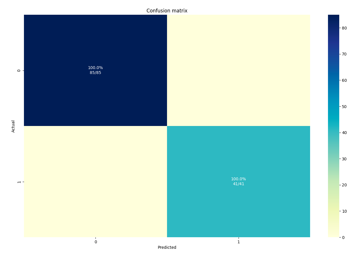
Confusion matrix plot
A confusion matrix is a table that is used to define the performance of a classification model. It is particularly useful when the outcomes are imbalanced. The confusion matrix shows the number of true positive, true negative, false positive, and false negative predictions made by the model.
A confusion matrix plot is a graphical representation of the confusion matrix. It usually shows the predictions of a classification model against the actual values. It is a heatmap that helps to visualise the performance of the model at a glance. The x-axis represents the predicted values, and the y-axis represents the actual values.
In a confusion matrix, the diagonal elements represent the correct predictions and the off-diagonal elements represent the incorrect predictions. The diagonal elements are also known as true positive (TP) and true negative (TN) and the off-diagonal elements are known as false positive (FP) and false negative (FN) respectively.
A confusion matrix can be used to calculate various performance metrics such as accuracy, precision, recall and F1 score. It can also be used to identify which classes the model is performing well and which classes are being misclassified. Overall, a confusion matrix is a powerful tool that can give a lot of insight into the performance of a classification model and can be used to improve the model's performance.
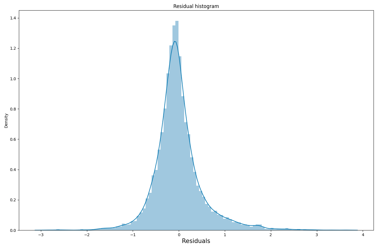
Residual histogram plot
A residual histogram plot is a visualisation tool used in regression analysis to analyse the difference between the predicted values and the actual values of a model. The residuals are calculated by subtracting the predicted values from the actual values, and the histogram plot shows the distribution of these residuals.
The plot is a histogram of the residuals, with the x-axis showing the range of residual values and the y-axis showing the frequency of those values. Ideally, the histogram should be approximately normally distributed with a mean of zero, which indicates that the model is a good fit for the data. If the histogram is not normally distributed or has a mean other than zero, it could indicate that the model is not a good fit for the data, and further analysis is needed.
A residual histogram plot is used to identify patterns in the residuals that can be used to improve the model. For example, if the residuals are skewed to one side, it could indicate that the model is under- or over-predicting for certain values. Additionally, if the plot shows multiple peaks, it could indicate that the model is not capturing some of the underlying patterns in the data, and it could be benefited from adding more variables to the model or using a different model altogether.
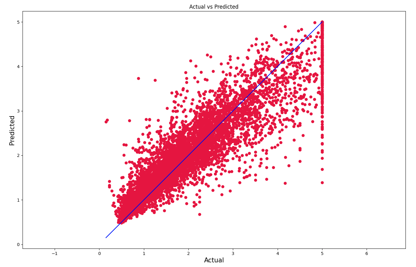
Actual versus predicted plot
An actual vs predicted plot is a visualisation tool used in regression analysis to compare the predicted values of a model with the actual values. The plot is a scatter plot, where the x-axis shows the actual values and the y-axis shows the predicted values. Each point on the plot represents an individual sample in the data set, with the x-coordinate being the actual value and the y-coordinate being the predicted value of that sample.
Ideally, the points on the plot should form a straight line that follows the y=x line, which indicates that the model is a good fit for the data. If the points deviate from the y=x line, it could indicate that the model is not a good fit for the data, and further analysis is needed.
An actual vs predicted plot can be used to identify patterns in the residuals that can be used to improve the model. For example, if the points are scattered in a random manner, it could indicate that the model is not capturing some of the underlying patterns in the data. Additionally, if the points are scattered along a diagonal line, it could indicate that the model is under- or over-predicting for certain values.
It is important to note that an actual vs predicted plot should be used in conjunction with other evaluation metrics such as mean squared error or mean absolute error. This would give a more complete picture of how well the model is performing.