Data version visualisation plots
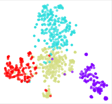
T-SNE plot
T-SNE (t-Distributed Stochastic Neighbour Embedding) is a technique for dimensionality reduction and visualisation of high-dimensional data. It is particularly useful for visualising clusters or patterns in data that has many features or variables. T-SNE maps the high-dimensional data into a lower-dimensional space, such as a 2D or 3D plot, while preserving the similarities between the data points.
A T-SNE plot is a visualisation of the data in the lower-dimensional space. It shows the relationships between different data points and can be used to identify patterns and clusters in the data. Each point on the plot represents an individual sample in the data set, with the x and y coordinates representing the reduced dimension of that sample.
T-SNE is a non-linear method and can produce different results depending on the initial conditions and parameters, and the final plot may look different each time it runs. Also, it is sensitive to the scale of the input data, and it is a good practice to normalise the data before applying T-SNE.
T-SNE is widely used in visualisation of high-dimensional data, such as images, text, and gene expressions. It can be used to identify patterns and clusters in the data, and can be useful for exploratory data analysis, feature selection, and anomaly detection.
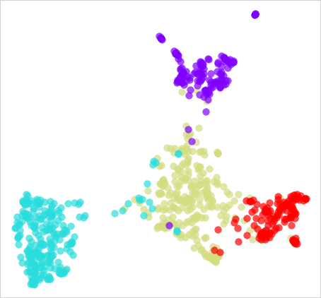
UMAP plot
UMAP (Uniform Manifold Approximation and Projection) is a dimensionality reduction technique that is similar to t-SNE (t-Distributed Stochastic Neighbour Embedding). It is used to map high-dimensional data into a lower-dimensional space, such as a 2D or 3D plot, while preserving the local and global structure of the data. The main difference between UMAP and t-SNE is that UMAP preserves the global structure of the data while t-SNE preserves the local structure.
A UMAP plot is a visualisation of the data in the lower-dimensional space. It shows the relationships between different data points and can be used to identify patterns and clusters in the data. Each point on the plot represents an individual sample in the data set, with the x and y coordinates representing the reduced dimension of that sample.
UMAP is a non-linear method and can produce different results depending on the initial conditions and parameters, and the final plot may look different each time it runs. Also, it is sensitive to the scale of the input data, and it is a good practice to normalise the data before applying UMAP.
UMAP is widely used for visualisation of high-dimensional data, such as images, text, and gene expressions. It is particularly useful for visualising complex datasets, where the relationships between samples are hard to understand. It can be used for exploratory data analysis, feature selection, and anomaly detection, and it is also used in generating synthetic data for training machine learning models.
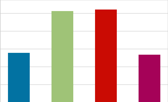
Label distribution plot
A distribution plot, also known as a histogram, is a visualisation tool used to show the distribution of a continuous or discrete variable. It is a graph that shows the frequency of different values of a variable. The x-axis of the plot shows the range of values of the variable, and the y-axis shows the frequency of those values. The plot is divided into bins, and the height of each bin represents the number of data points that fall into that bin.
A distribution plot can be used to understand the shape of the data, including the presence of outliers, skewness, and kurtosis. The shape of the plot can tell us if the data is symmetric, positively or negatively skewed and if it has fat or thin tails.
There are different types of distribution plots that can be used depending on the type of data and the purpose of the analysis. For example, a density plot is a smooth version of a histogram and it is used to visualise the probability density function of a continuous variable. A box plot is a visualisation tool used to show the distribution of a continuous variable and it is particularly useful for identifying outliers.
Overall, a distribution plot is a powerful tool for understanding the characteristics of a variable, and it can be used to identify patterns and relationships in the data.
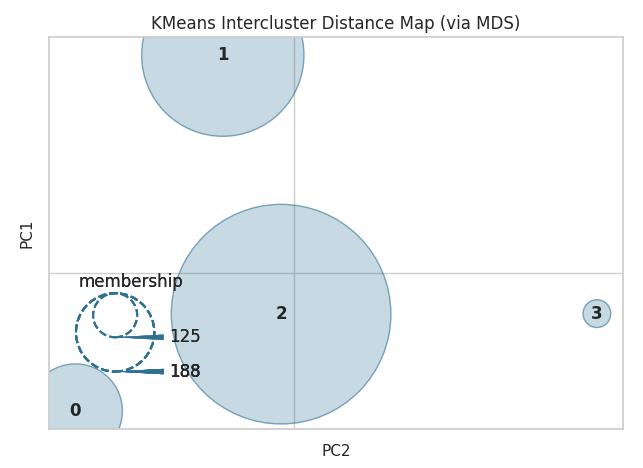
KMeans intercluster distance plot
A K-means intercluster distance map is a visualisation tool used to represent the relationships between different clusters in a K-means clustering analysis. The K-means algorithm is a method for partitioning a dataset into a specified number of clusters (K) based on the similarity of the data points.
The intercluster distance map shows the distance between each pair of clusters. The distance between clusters is typically measured by the Euclidean distance between the centroids (i.e., the mean of the points in each cluster). The plot can be represented in a matrix format, where the cells of the matrix represent the distance between the clusters represented by the corresponding rows and columns.
The K-means intercluster distance map can be used to understand the similarity or dissimilarity between the clusters and help in identifying patterns in the data. For example, clusters that are close together on the map are likely to be more similar to each other than clusters that are farther apart. Additionally, it can be used to choose the optimal number of clusters, by analysing the distances between the clusters, and it can also be used to evaluate the performance of the clustering algorithm.
Overall, the K-means intercluster distance map is a powerful tool for understanding the relationships between clusters in a K-means clustering analysis and for making decisions about the number of clusters to use.